
The last article in this series ended with a promise: make Keycloak stop looking like Keycloak. I kept it. The login pages got a custom template and stylesheet, and the roughly seventeen emails Keycloak sends got the same treatment.
It worked. I wasn't satisfied.
The login theme carried its own styles. The email theme carried its own resources. If I wanted a second branded version of the same authentication experience — another product, another client, another environment — I would have been copying files and hoping I remembered to update both.
That turned a styling exercise into an engineering question:
How do you build Keycloak themes once, reuse the common parts, and still let every application customize what it actually needs?
This article is the answer I arrived at, and it is part of my Engineering in Practice series, where I document the decisions and the reasoning behind real projects rather than the finished result alone.
The implementation lives in keycloak-modern-auth, the companion repository that evolves alongside these articles.
From customization to architecture
In the earlier work, the goal was simple: customize Keycloak. Replace the default login screen with a custom design, then do the same for the emails.
That's perfectly adequate when you have one application and one visual identity. But real systems grow.
You end up with multiple applications, multiple brands, several environments, or a few products sharing one identity provider — and each of them wants its own login experience and its own email branding.
At that point, duplicating templates and CSS across themes stops being convenient and starts being a liability:
theme-a/
├── login/
│   ├── template.ftl
│   └── resources/css/login.css
└── email/
    ├── html/template.ftl
    └── messages/

theme-b/
├── login/
│   ├── template.ftl        ← same file, second copy
│   └── resources/css/login.css
└── email/
    ├── html/template.ftl
    └── messages/
At two themes this looks harmless.
Then someone asks to change the border radius, or the input height, or the focus ring — and you have to remember every theme that contains a copy, and update them consistently.
Duplication that started as convenience has become an architectural problem.
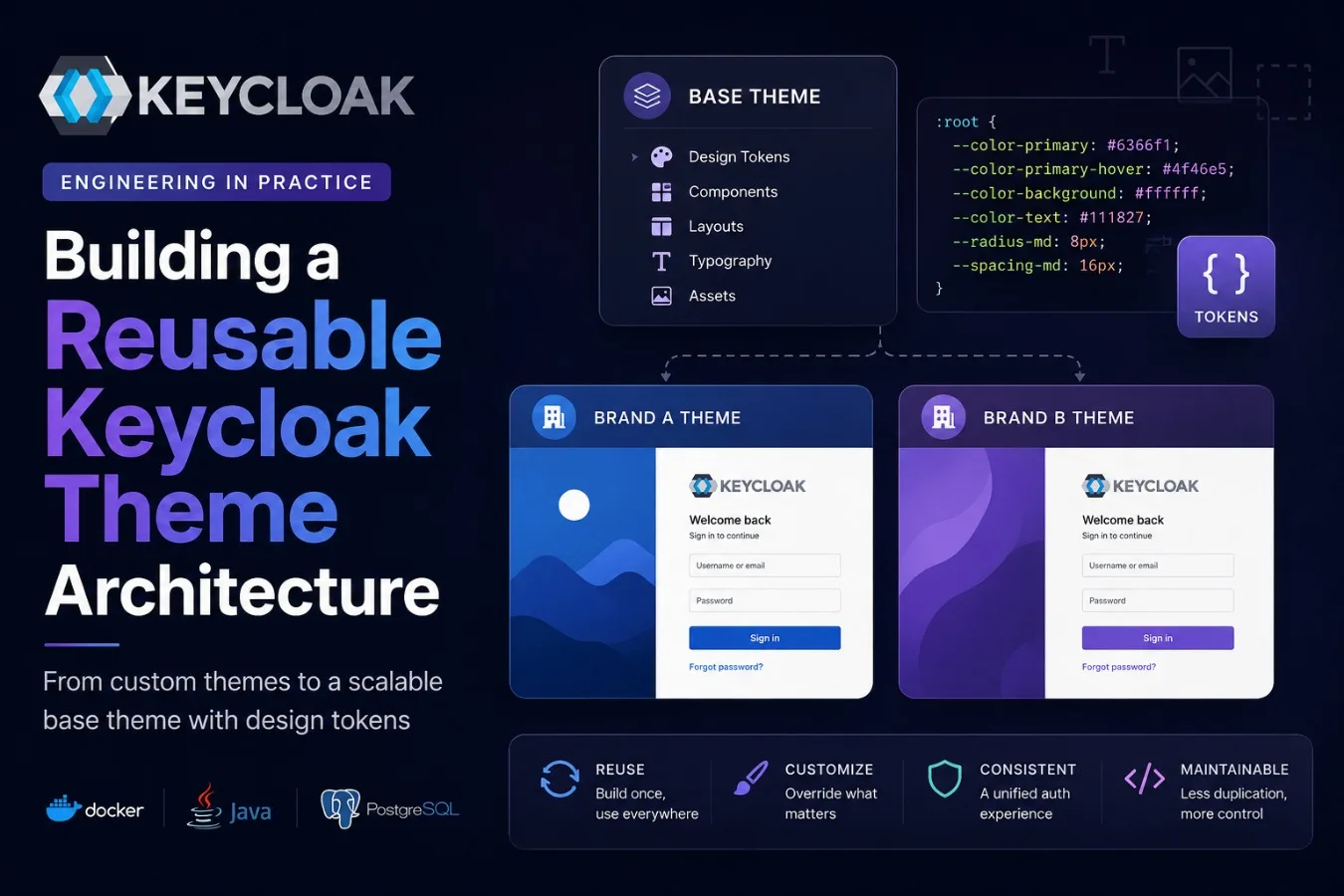
The idea: a reusable base theme
Instead of treating every Keycloak theme as an isolated implementation, I wanted a common layer underneath them:
               Base theme
                    │
         ┌──────────┴──────────┐
         │                     │
   Application A         Application B
         │                     │
     overrides             overrides
The base theme holds the authentication design. Derived themes hold only what makes them different.
This gives two properties that matter:
Reuse, because the shared templates and stylesheets exist in exactly one place.
Customization, because a derived theme can still override the parts that genuinely need to change.
It's the same instinct as inheritance in code: put the common behaviour in the base, specialize where necessary.
The interesting part is that Keycloak already gives you the mechanism — you just have to use it deliberately.
How Keycloak actually resolves themes
A theme declares its parent in theme.properties:
parent=modern.base
That single line is doing more than it looks like, because Keycloak resolves the four kinds of theme content by four different rules — and knowing which is which is most of the battle.
Properties merge vertically.
A child's theme.properties is layered over its parent's. Anything the child doesn't set, it inherits. This is the mechanism that makes token overriding work at all.
Templates resolve child-first, and whole-file.
If the child ships template.ftl, its version is used entirely; if it doesn't, the parent's is used entirely. There is no partial override, no block merging.
You inherit a template or you replace it — which is a good reason to keep base templates generic enough that nobody needs to replace them.
Resources resolve per file.
Drop a file at the same relative path and it shadows the parent's. This is how a child theme swaps img/logo.svg without touching a single line of CSS.
import= reaches sideways.
Inheritance runs vertically, from child to parent, within one theme type.
But a login theme and an email theme are different types, and both need the same brand colour. import= connects them, so shared values can live in a common theme that both types pull from:
modern.base/login  ←import←  modern.base/common
       ↑ parent                      ↑ parent
    acme/login     ←import←       acme/common
That diagram is the whole architecture.
Vertical arrows are inheritance; horizontal arrows are sharing across types.
In the repository, modern.base is the foundation and acme is a worked example of a child brand — one properties file and a logo.
This is also why I extend Keycloak's theme system rather than editing the built-in themes: the built-ins move underneath you on every upgrade, and you own the diff forever.
What belongs in the base theme
Getting the mechanism right is the easy half.
The harder question is what should actually live in the base — because a base theme that accumulates every possible customization is just a large theme with extra steps.
I settled on a simple rule:
The base owns structure, the child owns identity.
The base theme holds:
design tokens
typography scale
page layout
form and input styling
buttons
alerts and messages
shared assets
It answers the question:
How does the authentication interface work and look by default?
The derived theme holds:
logo
brand colours
favicon
product-specific assets
any genuinely necessary override
It answers a much narrower question:
How does this particular product want to be recognized?
That boundary is what keeps the abstraction honest.
If a child theme starts reaching for the structural layer, that's a signal the base is missing something — not a signal to fork the template.
Design tokens, and the loop that generates them
The piece that makes the split practical is design tokens.
Without them, values scatter through the stylesheet:
.kc-button-primary {
  background: #4f46e5;
}

.kc-input {
  border-color: #d1d5db;
}
Change the brand colour and you are grepping.
With tokens, the values are declared once and consumed everywhere:
:root {
  --kc-color-primary: #4f46e5;
  --kc-color-primary-hover: #4338ca;
  --kc-color-surface: #ffffff;
  --kc-color-text: #111827;
  --kc-color-border: #d1d5db;
  --kc-radius-md: 8px;
  --kc-space-md: 16px;
}

.kc-button-primary {
  background: var(--kc-color-primary);
  border-radius: var(--kc-radius-md);
}
The part I like, though, isn't the CSS.
It's where the values come from.
Rather than hand-writing that :root block, the base template walks the theme's properties and emits a custom property for every key that starts with kcToken, converting camelCase to kebab-case along the way.
So this:
kcTokenColorPrimary=#0d9488
becomes this, at render time:
:root {
  --kc-color-primary: #0d9488;
}
The loop is generic.
It enumerates properties; it doesn't know their names.
That detail carries more weight than it first appears: a child theme that invents:
kcTokenBannerHeight=4rem
gets:
--kc-banner-height
for free, with no change to the template and no change to the base.
The extension point is the properties file, not the code.
The base currently declares 58 tokens plus 24 dark-mode overrides, grouped roughly by colour scheme, surfaces, brand, status colours, typography, shape, spacing and layout.
Dark mode reuses the same variable names inside a prefers-color-scheme block, and only colours are overridden — spacing, radii and typography are shared, because a login form shouldn't change shape when the sun goes down.
Why this matters across brands
Now put inheritance and tokens together.
Two products, one authentication architecture.
The base defines the full token set.
Brand A overrides one line:
kcTokenColorPrimary=#2563eb
Brand B overrides one line:
kcTokenColorPrimary=#7c3aed
The components don't change.
The templates don't change.
The authentication flow certainly doesn't change.
In practice a child theme is a parent=, an import=, a handful of colours, a logo file, and a message bundle entry for the name shown in the admin console:
                Base theme
                    │
            Shared components
                    │
              Design tokens
                    │
         ┌──────────┴──────────┐
         │                     │
      Brand A               Brand B
         │                     │
      Blue UI              Purple UI
This is exactly the reuse I was looking for, and it is worth being precise about why it works:
The tokens are the only public surface between the base and its children. Everything else is implementation detail.
The email theme, where none of this is allowed
Login themes are rendered in a browser.
Emails are rendered by mail clients, and mail clients are a different century.
No external stylesheets — clients drop <link> entirely.
No CSS custom properties — Gmail strips var(), so the entire mechanism above simply evaporates.
Outlook's Word engine only reliably understands pixels.
Flexbox and grid are out; fixed-width tables are in.
So the same architecture had to arrive by a different route.
In the email theme, tokens are resolved at render time in FreeMarker and interpolated straight into style attributes, with a literal fallback if the property is missing:
<#local colorPrimary = properties.kcTokenColorPrimary!'#4f46e5'>
The design system is identical — same properties, same names, same child overrides.
Only the delivery differs:
the browser resolves variables at paint time
FreeMarker resolves them at send time
That let all seventeen emails share a single template shell, with the body copy arriving as pre-formatted strings from the message bundles, and all 36 shipped language translations preserved.
A child theme rebrands every email it sends by changing the same colour it changed for the login page — because both types import the same common theme.
Keeping overrides intentional
Inheritance is useful.
Unlimited overriding is not.
If every derived theme overrides everything, you have arrived back at duplicated themes with extra indirection.
So the customization boundary has to stay clear, and I find it easier to state as two questions:
The base theme answers: how does authentication look and behave by default?
The derived theme answers: how does this product want to brand it?
Layout, forms, buttons, typography and spacing are the base's responsibility — a child may override them, but doing so should feel like a decision, not a default.
Primary colour, logo, favicon and product-specific assets are the child's responsibility, and always were.
Everything in between deserves a conversation before it gets copied.
Applying this to the repository
keycloak-modern-auth isn't a sample project built to illustrate a finished idea.
It's the actual thing, evolving:
v0.1   Keycloak setup: Reproducible Keycloak + PostgreSQL stack
  ↓
v0.2   Custom login theme
  ↓
v0.3   Custom email theme
  ↓
next   Derived themes, configuration as code
I keep evolving one repository instead of creating a fresh one per experiment, and that's deliberate.
Separate repositories make each example easy to read while hiding the thing I actually care about:
Engineering decisions are incremental. The first implementation is rarely the final architecture.
The honest progression looks more like this:
"It works."
      ↓
"But there's duplication."
      ↓
"Extract the common parts."
      ↓
"Make the design configurable."
      ↓
"Now a brand is twenty lines and a logo."
That's much closer to how a real project moves.
The repository stops being sample code and becomes a record of the architectural evolution — including the steps that were replaced.
The trade-off
A base theme isn't automatically better.
It's another abstraction, and abstractions charge rent.
You now have two artifacts where you had one, and anyone touching the themes has to understand the inheritance relationship before they can safely change anything.
Debugging gets less direct, too: when a style comes from the derived theme it's obvious, and when it comes from the parent — or from a property merged three levels up — you need to know where to look.
Whole-file template resolution has a sharp edge as well, since a child that overrides template.ftl to change one line silently stops inheriting every future improvement to the base.
This is the classic bargain:
You accept some additional complexity in exchange for less duplication and more consistency.
For a single small Keycloak installation, that trade isn't obviously worth it.
For multiple applications or brands, it stops being close.
What I learned
The interesting part of this exercise wasn't writing CSS.
It was noticing the moment customization turned into architecture.
At the start, the question was:
How do I customize Keycloak?
Later it became:
How do I make this customization reusable?
Those are different questions with different answers.
The first produces a working theme.
The second produces a system for producing themes.
The distinction I try to hold onto is this:
Don't introduce an abstraction because it looks elegant. Introduce it when a repeated problem justifies it.
Here, the repeated theme structure and the need for consistent branding across products supplied the justification.
Keycloak's inheritance provided the mechanism, and design tokens provided a clean way to make the visual system both reusable and customizable.
What's next
The base theme is one step, not a destination.
The directions I want to explore next are mostly about everything around the theme rather than the theme itself:
more reusable authentication components
better token organization
multiple derived brands
automated validation so a broken theme fails before it reaches an environment
packaging themes into the image rather than bind-mounting them
Underneath all of that sits a problem I keep running into:
How do you keep Keycloak configuration synchronized across development, staging, qualification and production?
Themes are the visible layer, but realms, clients, roles, mappers and flows are the part that actually drifts.
That's where theme customization stops being a frontend concern and turns into an infrastructure one — and it's what I want to write about next.
Final thoughts
What started as a Keycloak customization is slowly turning into a small authentication platform.
The lesson isn't that every Keycloak project needs a sophisticated base theme.
It's that architecture should follow the problems you actually hit.
Start simple.
Notice the duplication.
Learn the extension points the platform already gives you.
Extract only the parts that are genuinely reusable.
Then introduce the abstraction.
The implementation continues to evolve in keycloak-modern-auth, alongside this series.
This is engineering in practice: not designing the perfect architecture upfront, but improving it as the real problems come into focus.
This article is part of the Engineering in Practice series.
Comments(0)
Join the discussion by logging into your account.
No comments yet. Be the first to comment!