
Most editor themes begin with an aesthetic.
Cyberpunk. Monochrome. Pastel. A film, a football club, a city at night or somebody's idea of what a terminal should have looked like in 1987.
Atelier Chromatique began with a different question: what if the colours in a code editor were treated more like the colours in a building?
That sounds slightly dramatic for a collection of JSON files. I know. But the more I read about Le Corbusier's approach to colour, the less strange the connection felt.
For him, colour was not something applied after the architecture was finished. It could make a wall advance or recede, separate what mattered from what did not, alter the apparent depth of a room and change how that room felt to the person inside it.
A code editor is not a building, obviously. Still, it is a visual space many of us inhabit for hours every day. It has structure, depth, focal points and background elements. Some information should come forward. Some should remain quiet. Errors must interrupt you. Comments usually should not. The cursor needs to be found immediately without turning the entire interface into a warning sign.
That is the idea behind Atelier Chromatique: four editor themes inspired by Le Corbusier's Architectural Polychromy collections of 1931 and 1959, adapted for the very different job of reading and writing code.
Le Corbusier was never only about white
The popular image of modernist architecture is often a white box: clean planes, concrete, glass and almost no colour.
Le Corbusier's own work is more complicated than that image suggests. The Fondation Le Corbusier documents coloured walls in his work as early as 1912, followed by experiments with colour on façades and interiors during the 1920s.
In collaboration with the wallpaper manufacturer Salubra, he later produced two architectural colour collections.
The 1931 collection contained 43 shades and 12 colour keyboards.
The 1959 collection added 20 brighter and more intense shades, taking the system to 63 colours.
The keyboards are the part I find especially interesting. This was not simply a catalogue asking somebody to choose their favourite swatch. The colours were organised into combinations and atmospheres, with viewing cards that could isolate a small group of tones at the same time.
In other words, the system was about relationships.
A colour does not work alone. It changes according to the light, the material, the size of the surface and every colour placed beside it. The same is true in an editor. A beautiful blue can become useless if it competes with five equally strong accents. A subtle grey can be perfect for comments and terrible for normal text.
Le Corbusier wrote that “colour is the immediate, spontaneous expression of life.” I like that sentence because it is much warmer than the severe image usually attached to modernism. His colour theory was controlled, but it was not lifeless.
Colour as a way to organise space
The most useful part of Architectural Polychromy is not the historical label or the individual shades. It is the idea that colour can perform a function.
Le Corbusier described blue as a colour that could make a plane recede and red as one that could establish or hold the presence of a wall. He divided tones broadly between the side of light—warmth, energy and joy—and the side of shadow—coolness, calm and melancholy. White often acted as the field in which the other colours became more precise.
These are architectural ideas, not syntax-highlighting rules. I did not want to pretend there is a scientific formula saying that every JavaScript keyword must be ultramarine because a blue wall appears farther away.
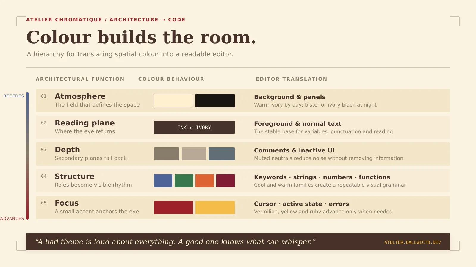
The useful translation is simpler:
Background colours establish the atmosphere of the workspace.
Foreground colours create the main reading plane.
Muted tones allow comments and secondary interface elements to recede.
Strong accents pull the cursor, active states and important syntax forward.
Warm and cool colours separate roles without relying on brightness alone.
Repeating a small number of colours creates rhythm and consistency.
A bad theme is loud about everything. A good one knows what can whisper.
From 63 architectural colours to four editor themes
Atelier Chromatique includes four themes: 1931, 1959, Clair and Nuit.
The first two take their character from the respective historical collections. The other two are composite interpretations designed around the practical choice most developers make first: do I want a light editor or a dark one?
Theme | Mode | Background | Foreground | Cursor | Character |
|---|---|---|---|---|---|
Atelier Chromatique 1931 | Light |
|
|
| Warm, chalky and softly contrasted |
Atelier Chromatique 1959 | Dark |
|
|
| Bold, vivid and deeply architectural |
Atelier Chromatique — Clair | Light |
|
|
| A calm combination of both collections |
Atelier Chromatique — Nuit | Dark |
|
|
| A warm and restrained night interpretation |
These are screen adaptations, not a claim to reproduce physical paints or historical materials exactly. A colour on a wall changes with pigment, texture, daylight and scale. A HEX value changes with the display, colour profile, brightness and surrounding UI.
The goal was to preserve the relationships and character of the source palettes while building themes that actually work on a modern screen.
1931: warm light without the hospital feeling
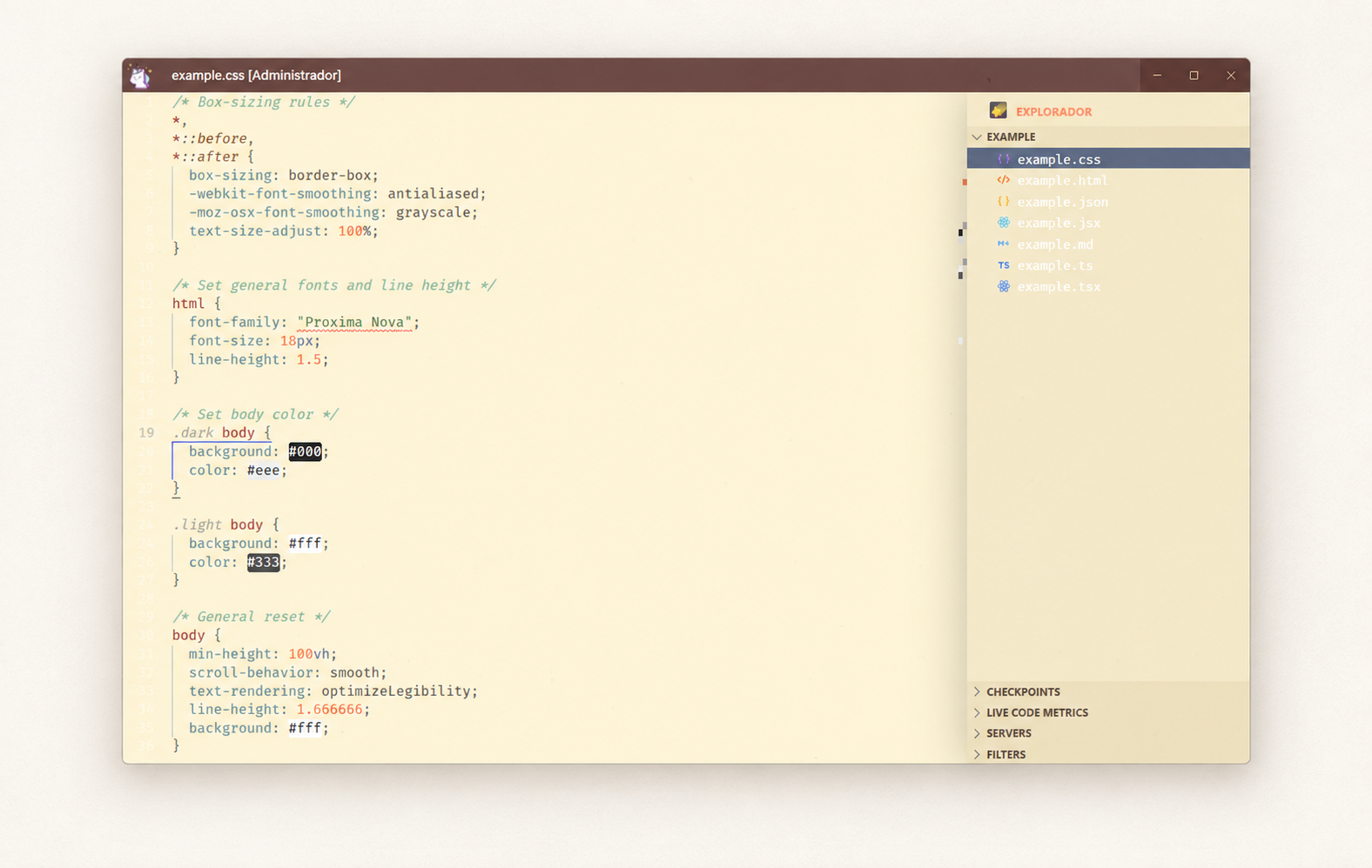
Atelier Chromatique 1931 is built on a warm ivory background rather than pure white.
Pure white can make a light theme feel clinical, especially on a bright monitor. The ivory base, #FFF1CE, softens the canvas without turning it beige enough to reduce clarity. Ink brown replaces the usual near-black foreground, while vermilion, muted ultramarine, English green, burnt sienna and umber establish the syntax.
The result feels closer to paper, pigment and an architect's drawing table than to a blank browser page.
That atmosphere does not mean low contrast everywhere. The vermilion cursor is deliberately easy to find. Keywords use blue, strings move into green, numbers take an earthy orange and functions receive a darker red. Comments sit back in a natural grey-brown and use italics.
It is a light theme, but it does not try to become invisible. It simply uses warmth instead of glare.
1959: the more intense collection after dark
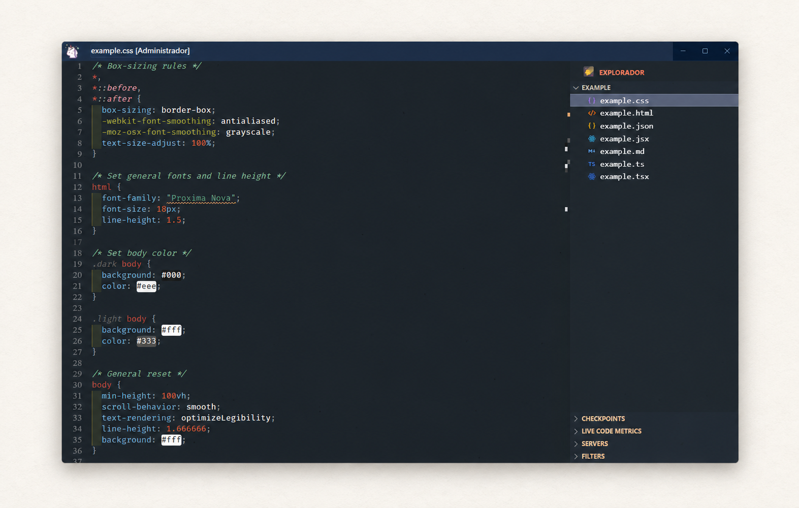
The historical 1959 collection introduced 20 shades described by the Fondation as brighter and more intense. That gave me a natural direction for the dark theme.
Atelier Chromatique 1959 uses an ivory black ground, #080F15, with pale ivory text. Vermilion, cerulean, olive, pink, ochre and bright yellow sit against that near-black base with much more energy than the 1931 theme.
The bright yellow cursor is the most immediate accent. It is small, functional and impossible to lose. The selection uses a transparent ultramarine, functions appear in yellow, types in cerulean, strings in green and numeric values in vivid orange.
This is the bolder member of the collection, but I did not want “bold” to become “every token has started shouting”. The near-black background creates enough space for the stronger colours to work without needing to use them everywhere.
It is the theme I would choose when I want contrast and personality, but still want the editor to feel composed.
Clair and Nuit: the practical interpretations
The two dated themes are the conceptual starting point. Clair and Nuit are where the collection becomes more flexible.
Clair
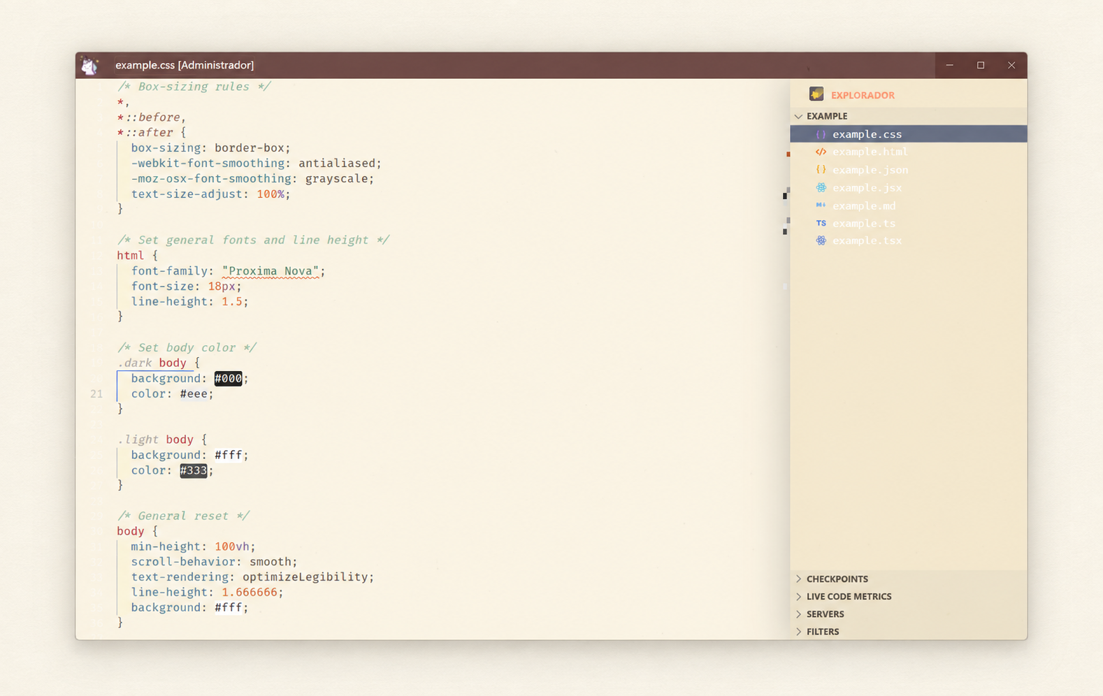
Clair combines colours from both collections over a softer parchment background. It keeps the warmth of 1931 but introduces some of the sharper relationships associated with 1959. The foreground is a deep sepia, the cursor is vermilion and the accents move between ultramarine, green and sienna.
It is the quietest light option and probably the easiest place to start if you normally use light themes.
Nuit
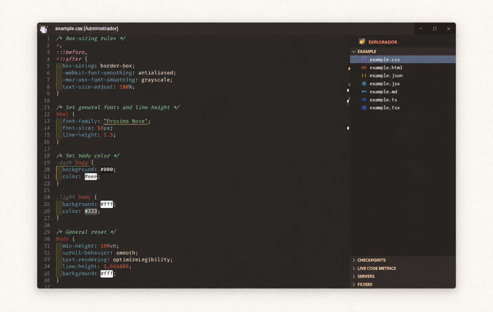
Nuit brings both collections into a warm, near-black environment. Its bister background has a brown undertone, so it feels very different from the blue-black or neutral charcoal used by many dark themes. Warm ivory forms the main text plane, while cerulean, ochre, burnt earth, green and pink provide the syntax structure.
Nuit is not just 1959 with lower contrast. The two dark themes have different temperatures. 1959 is sharper and more graphic; Nuit is warmer, quieter and slightly more nocturnal in the literal sense.
Two originals, two composites. That structure gave the project enough variety without turning it into a folder of barely different variants.
A theme still has to work as a developer tool
The historical idea matters, but nobody should install a theme because the explanation sounds clever.
It still has to survive a normal working day.
Each Atelier Chromatique theme defines 122 workbench and editor colour roles, covering the editor, sidebar, activity bar, tabs, terminal, Git decorations, inputs, buttons, notifications, widgets and other parts of the VS Code interface. Each one also includes 23 token-colour rules with semantic highlighting enabled.
The token system keeps the same broad hierarchy across all four themes:
Code role | General colour direction |
|---|---|
Comments | Muted neutral, italic and visually recessed |
Strings | Greens |
Regular expressions and escapes | Deeper green or teal |
Numbers and constants | Orange or ochre |
Keywords and storage types | Ultramarine or related cool tones |
Functions | Red, ruby or bright yellow depending on the theme |
Types and classes | Blue or cerulean |
Variables | Main foreground and earth tones |
Tags and headings | Vermilion or warm accent colours |
Invalid syntax | A distinct ruby warning tone |
The exact colour changes with the theme, but the visual grammar remains familiar. Switching from 1931 to Nuit changes the atmosphere without forcing you to relearn the code.
The extension is also intentionally small. It contributes standard VS Code colour-theme files—no account, no background service and no runtime feature competing for attention. Install it, select a theme and the job is done.
Restraint was the difficult part
My other theme project, BESUR, taught me how much personality an editor can take before colour stops helping and starts becoming noise. BESUR is energetic by design. Atelier Chromatique needed a different kind of discipline.
The temptation with a source collection of 63 colours is to use all 63 at once.
That would be historically enthusiastic and visually terrible.
Le Corbusier's colour keyboards were useful precisely because they reduced a large collection into controlled relationships. I tried to follow the same principle in the extension. Every theme uses a limited group of recurring tones, and each tone has a job.
The most difficult decisions were often not about which colour to add, but which one to remove. If the cursor, keyword, function, number, string and active tab all demand equal attention, there is no hierarchy left. Restraint is what allows one strong vermilion or yellow accent to mean something.
That is also why the interface is not treated as a separate grey shell around colourful code. The editor chrome and the syntax belong to the same room. Activity bars, borders, selections and Git states all need to feel related to the text in the centre.
This is an interpretation, not an official digital colour system
Atelier Chromatique is an independent project inspired by historical architectural colour systems. It is not affiliated with, endorsed by or connected to the Fondation Le Corbusier, any estate or any colour-system rights holder.
That distinction is important for more than a legal sentence at the bottom of a page.
The authentic Architectural Polychromy is a physical and historically documented system. Atelier Chromatique is a developer theme influenced by its ideas and adapted to RGB displays. The colour names and catalogue references acknowledge the source, while the approximate HEX values serve the practical needs of the extension.
I would rather be clear about that than pretend a laptop panel can reproduce the experience of pigment across an entire wall.
The project is released under the MIT License, so you can inspect the theme files, adjust individual colours and create personal variations while keeping the overall chromatic character intact.
Install Atelier Chromatique
Atelier Chromatique is available from both major registries used by VS Code-compatible editors.
Explore the four themes and colour collection
Install from the Visual Studio Marketplace
You can also install it directly from the editor:
Open the Extensions view.
Search for
Atelier Chromatique.Install the extension published by Ballwictb Themes on the VS Code Marketplace or ballwictb on Open VSX.
Open the Color Theme picker.
Choose 1931, 1959, Clair or Nuit.
The Open VSX release makes the collection available to compatible editors such as Windsurf and VSCodium as well as environments that use the same registry.
Building a room for code
I did not create Atelier Chromatique to make a digital museum piece.
I created it because Le Corbusier's way of thinking about colour still feels useful: colour can create space, establish hierarchy and change the way we experience an environment. Those ideas do not stop being interesting when the wall becomes a screen.
The four themes are different answers to the same question. 1931 is warm and softly architectural. 1959 is dark and intense. Clair combines both collections in daylight. Nuit brings them together after dark.
None of them tries to recreate a room from 1931 inside VS Code. They take the logic behind those rooms and apply it to another place where structure matters.
After all, code also has planes. It has foreground and background, rhythm and interruption, essential elements and secondary ones. We move through it, return to familiar corners and notice immediately when something is out of place.
If an editor is somewhere I am going to spend thousands of hours, I want its colours to do more than look attractive in a screenshot.
I want them to build the room.
Atelier Chromatique is created and maintained by Ballwictb and distributed under the MIT License.
If it annoys you twice, turn it into a tool.
See you in the next build.
— Ballwictb
Comments (0)
Join the discussion by logging into your account.
No comments yet. Be the first to comment!