
CSS unit conversion is not difficult. That is exactly why it becomes so annoying.
You see 24px and wonder how many rem that is. You find 1.125rem in an old component and quickly calculate its pixel value. Then a design uses points, a responsive section uses viewport units, and suddenly a tiny check has pulled you away from the code.
None of those calculations is complicated, but every one of them breaks your concentration.
I built FormatSizer to remove that interruption.
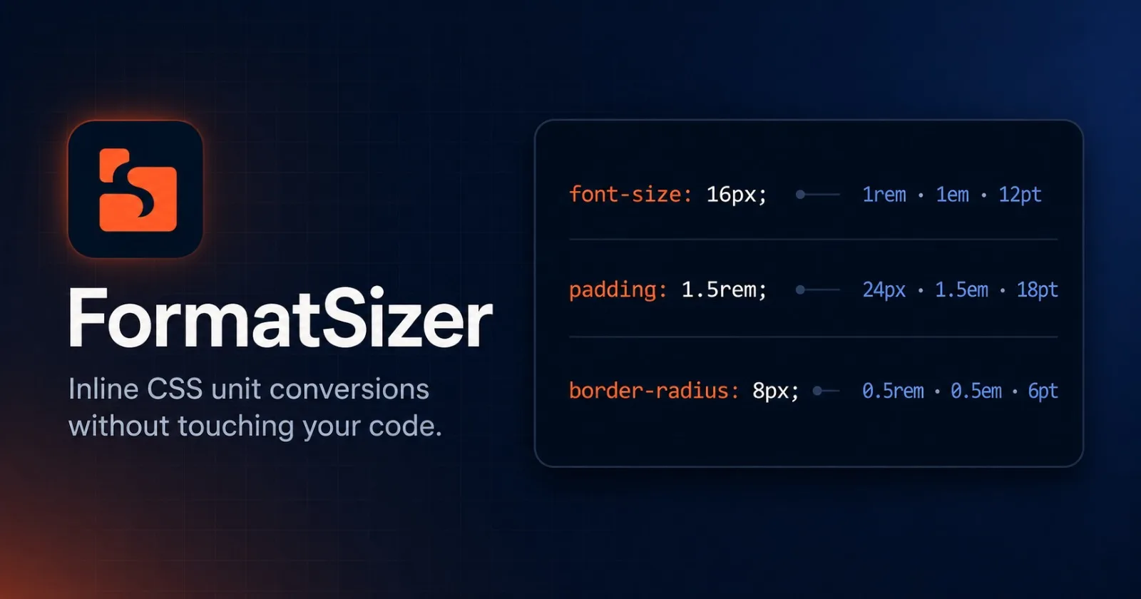
FormatSizer is a Visual Studio Code extension that displays CSS unit conversions directly in the editor. The conversions appear beside the original value, where you need them, but they are only visual decorations. Your source code remains completely untouched.
The idea in one glance
With FormatSizer enabled, code like this:
.hero-title {
  font-size: 48px;
  margin-bottom: 1.5rem;
}

.card {
  padding: 16px;
  border-radius: 8px;
}
is displayed in the editor with inline information similar to this:
font-size: 48px;       -> 3rem · 3em · 36pt <-
margin-bottom: 1.5rem; -> 24px · 1.5em · 18pt <-
padding: 16px;         -> 1rem · 1em · 12pt <-
border-radius: 8px;    -> 0.5rem · 0.5em · 6pt <-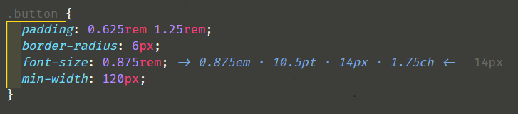
The annotations help you understand each value immediately. Save the file, copy the code, commit it, or open it in another editor and only the original CSS is there.
Useful information, not extra code
The most important decision behind FormatSizer was that it should never rewrite the document.
The extension uses VS Code's TextEditorDecorationType API with after.contentText to render each conversion after the detected value. This means the annotation lives in the editor interface rather than inside the file.
That distinction matters. FormatSizer does not:
Insert comments beside your properties
Replace one unit with another
Reformat your CSS
Create changes for Git to track
Add text that could accidentally reach production
It simply adds context while you work.
Why I made it
Developer tools often focus on large, complex problems, but some of the best tools solve the small annoyances we repeat every day.
Before FormatSizer, checking a unit meant doing the calculation mentally, opening a converter, using the browser console, or searching for the formula. Each option worked, but all of them interrupted the actual task.
I wanted the answer to appear at the exact moment and place where the question came up: next to the value in the editor.
The result is deliberately simple. Open a supported file, write a CSS value, and keep coding.
More than px and rem
FormatSizer supports the units most commonly found across stylesheets and component-based frontends:
pxrememptvwvhcmmmin
This is useful when modernizing an older stylesheet, translating design specifications into CSS, comparing values across a mixed codebase, or checking whether two differently written values are actually equivalent.
For example, with a root font size of 16px, these values all represent the same size:
16px = 1rem = 12ptAnd with a configured viewport width of 1920px:
50vw = 960px = 60remYou can choose which target units are shown and the order in which they appear, so the editor does not need to become crowded with conversions you never use.
Built for the files frontend developers actually use
CSS does not only live in .css files anymore, so FormatSizer supports the following languages by default:
CSS · SCSS · SASS · LESS · HTML · JavaScript · TypeScript
React · Vue · Svelte · Stylus
That includes the VS Code language modes javascriptreact and typescriptreact, allowing conversions to appear while working with styles in JSX and TSX files.
The list of active languages is configurable. If you only want FormatSizer in CSS, SCSS, and LESS, you can limit it to those three. If your project uses another compatible language mode, you can add it.
A closer look without visual noise
Inline annotations should make code easier to read, not compete with it.
FormatSizer lets you control the annotation color, optional background color, separator, number of decimal places, and target units. You can keep the default subtle blue, use a muted gray, or choose a color that fits your current theme.
When you need more information than the inline annotation provides, hovering over it opens a richer tooltip with the complete conversion table. The editor stays compact while the detailed values remain one hover away.
Here is an example configuration:
{
  "formatsizer.rootFontSize": 18,
  "formatsizer.elementFontSize": 16,
  "formatsizer.viewportWidth": 1440,
  "formatsizer.viewportHeight": 900,
  "formatsizer.decimals": 2,
  "formatsizer.color": "#88c0d0",
  "formatsizer.separator": " | ",
  "formatsizer.unitsToShow": ["rem", "pt", "px"],
  "formatsizer.languages": ["css", "scss", "less"]
}
Every option is also available in the regular VS Code Settings interface under the FormatSizer section, so editing settings.json is optional.
Conversions that match your project
Not every project uses the browser default of 1rem = 16px, and viewport units only make sense when they are calculated against the right dimensions. For that reason, the values behind contextual conversions are configurable.
Setting | Default | Used for |
|---|---|---|
|
|
|
|
|
|
|
|
|
|
|
|
|
| Converted value precision |
This is also an important limitation to explain clearly: FormatSizer is an editor helper, not a browser layout engine. It cannot know every computed font size produced by inheritance, media queries, or the live DOM. em, vw, and vh conversions therefore use the reference values you configure.
That makes the output predictable and useful without pretending to reproduce the browser's full rendering context.
The fixed physical conversions follow the standard CSS reference ratios:
Unit | Conversion to pixels |
|
|
|
|
|
|
|
|
Designed to stay out of your way
FormatSizer waits 300 milliseconds after an edit before recalculating its decorations. This small debounce prevents unnecessary work on every keystroke while still making the result feel immediate.
You can also control the extension from the Command Palette with two commands:
FormatSizer: Toggle decorations — temporarily show or hide all annotations
FormatSizer: Refresh decorations — force an immediate recalculation
The toggle is useful when sharing your screen, taking a clean screenshot, or simply wanting an undecorated editor for a moment.
Who is FormatSizer for?
FormatSizer is especially useful if you:
Move frequently between
px,rem, andemReceive designs with dimensions in a different unit from your codebase
Maintain projects where several CSS unit conventions coexist
Are learning how relative and absolute CSS units compare
Review frontend code and want to understand sizes at a glance
Prefer small tools that remove repeated context switching
It does not try to choose the best unit for you. That decision still depends on the component, accessibility requirements, responsive behavior, and your project's conventions. FormatSizer gives you the information needed to make that decision faster.
Install FormatSizer
FormatSizer is available for Visual Studio Code through the VS Code Marketplace and for compatible editors through Open VSX.
After installing it, open any supported file and write or hover over a CSS size value. The default configuration works immediately, and you can adjust it later from Settings.
A small extension for a very repetitive problem
FormatSizer started with a simple thought: I should not have to stop coding just to remember whether 24px is 1.5rem.
The extension does one focused job. It places useful conversions beside the code, keeps them out of the actual file, and lets you decide exactly how they should look and behave.
No copying values into a converter. No temporary calculations. No comments to delete afterwards.
Just the information you need, exactly where you need it.
If you try FormatSizer, I would genuinely like to hear which units, languages, or configuration options would make it more useful in your workflow.
If it annoys you twice, turn it into a tool.
See you in the next build.
— Ballwictb
Comments (0)
Join the discussion by logging into your account.
No comments yet. Be the first to comment!