
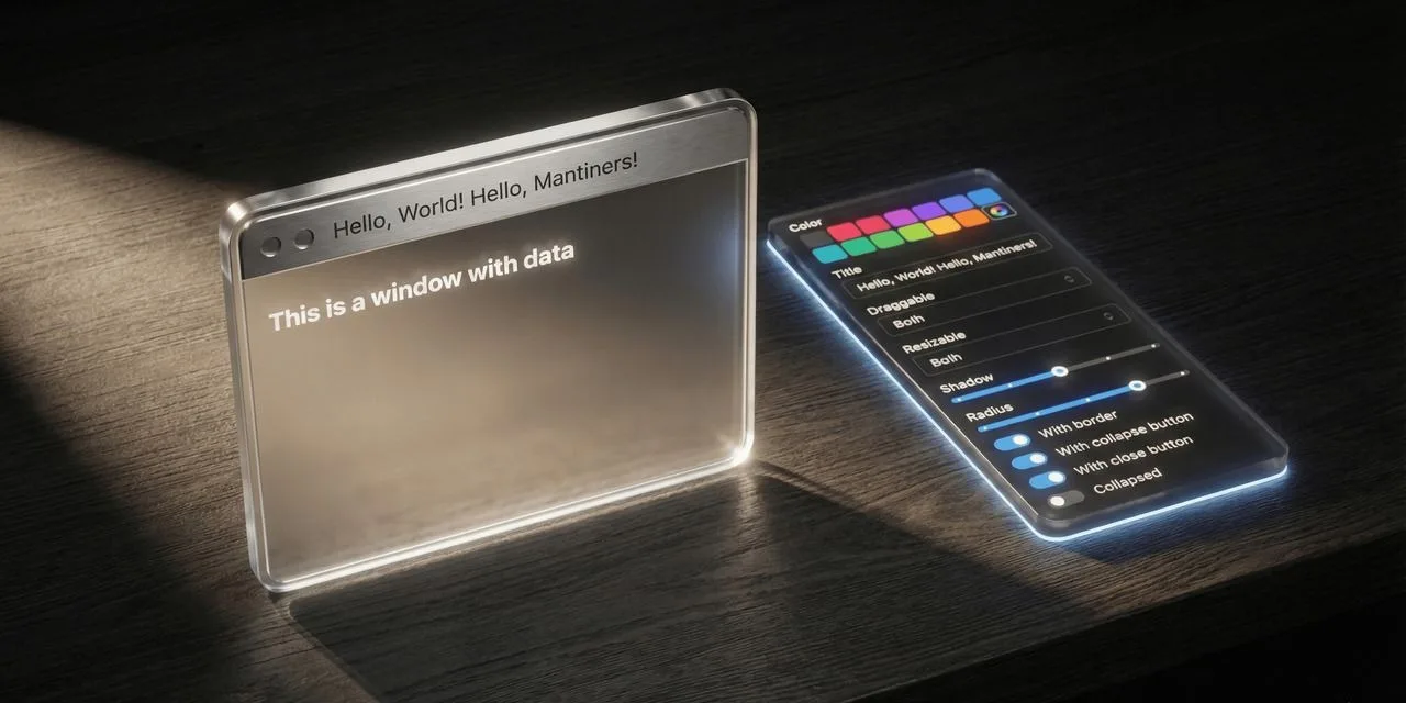
🪟 Window 3.2.0 — the edges of a gesture
Window now has the full set of six lifecycle callbacks, matching core's FloatingWindow: onDragStart, onDragEnd, onResizeStart and onResizeEnd alongside the two change callbacks it already had.
The two change callbacks fire on every frame of a gesture, so anything you wanted to do once — persist a layout, pause an expensive child, show a snap guide, record a single undo entry — meant debouncing by hand and guessing when the user had stopped. Fully additive: four optional props, no default changed. A mousedown on an interactive child or a data-no-window-drag region still does not open a drag, so no start event fires there, and a resize never emits drag callbacks. Closes #47.
📚 Docs and live demo · 📦 npm · 🏷️ Release 3.2.0
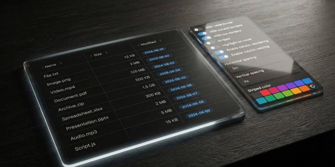
📋 ListViewTable 4.1.10 — bulk actions, with no new API
Mantine 9.6's ActionBar is built to be driven by a table selection, and ListViewTable already had selectionMode, selectedRows and onSelectionChange. There is now a demo showing the two composing: opened follows the length of the selection, the buttons act on the records handed to onSelectionChange, and ActionBar.CloseButton clears it through onClose. Nothing was added to the library — the capability was there, the demonstration was not. Closes #41.
📚 Docs and live demo · 📦 npm · 🏷️ Release 4.1.10
✨ BorderAnimate 3.0.2 — where the border actually goes
BorderAnimate draws its border against its own root. The Input Fields demo wrapped a whole TextInput — an Input.Wrapper: label, description, control and error in one box — so the animated border enclosed the label and a radius set to match the input traced a much taller box. The rule, now in the docs: Input.Wrapper holds the label, BorderAnimate holds only the Input. The same shape had leaked into the Triggers demo, where the focus-within card was a TextInput while its siblings were Paper + Text; all three are now built the same way. Closes #33.

📚 Docs and live demo · 📦 npm · 🏷️ Release 3.0.2
🃏 Flip 4.0.14 — the picker that was unstyled for months
The credit-card demo's MonthPickerInput rendered fine and came up bare: @mantine/dates was a declared dependency but its stylesheet was never imported in the docs bootstrap. Nothing fails when that import is missing, which is why it survived.
📚 Docs and live demo · 📦 npm · 🏷️ Release 4.0.14
🔧 Mantine 9.6.1, everywhere
Mantine 9.6.1 and React 19.3 across every component, both starter templates and the Hub, with Next 16.3.5 and a round of tooling updates. Peer ranges unchanged (>=9.0.0). Templates: Nextra starter 6.0.16, Fumadocs starter 1.0.10, Hub 1.0.15.
→ Browse every component on the Hub
🛠️ Infrastructure
Every GitHub Action is pinned to a commit SHA with the version as a trailing comment, with Dependabot opening a grouped PR when an action ships a release. The bot configuration is now byte-identical across every component repository, and a repository that had been running a second update bot in parallel was brought back in line — two bots proposing overlapping updates produced pull requests that were obsolete by the time anyone read them.
💡 Pro Tip
A Mantine package used in your app needs its stylesheet imported, and nothing fails if it isn't. Declaring @mantine/dates and rendering a MonthPickerInput gets you a working, interactive, unstyled component — no error, no warning, no failed build.
The part worth keeping is how to check it rather than squinting at a screenshot. Mantine's built CSS ships hashed class names (.m_14c23465), not the readable mantine-MonthPicker-* seen in devtools, so grepping loaded stylesheets for "PickerControl" finds nothing whether or not the import is there — it looks like the bug either way. Pick a hashed selector present in that package's styles.css and in no other, then count matching loaded rules: it went from 0 to 10 with one import line. A number you can read beats an impression of "looks about right".
Comments (0)
Login to post a comment.